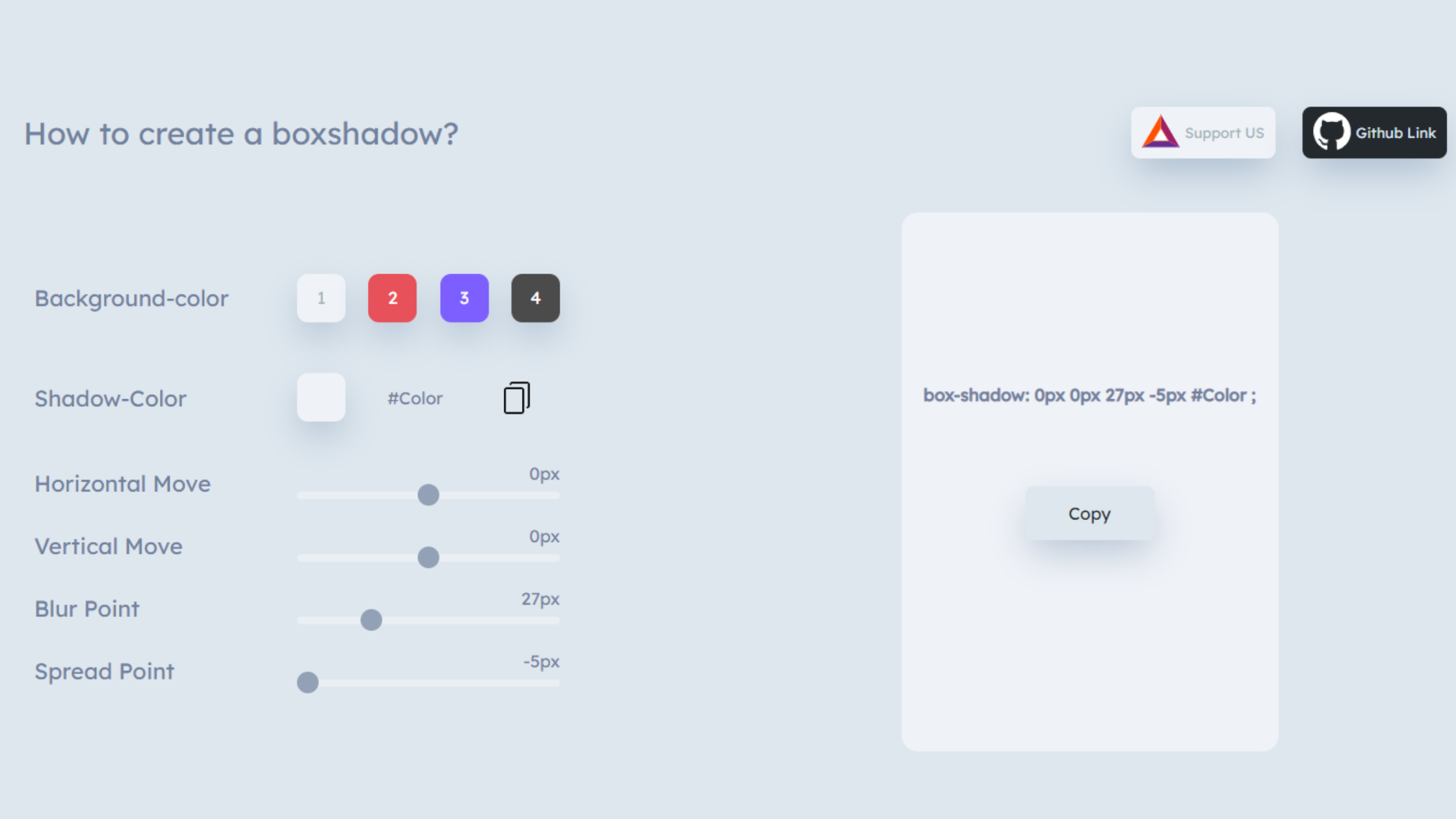
How to create a boxshadow?

Background-color

1
2
3
4

Shadow-Color

{{colorPicker}}

Horizontal Move

{{horizontal}}px

Vertical Move

{{vertical}}px

Blur Point

{{blur}}px

Spread Point

{{spread}}px

box-shadow: {{boxShadow()}} ;

Copy

#Copied

Beautiful CSS box-shadow examples

Here are the top beautiful css box-shadows showcased on how to create a box shadow? (just click on the box-shadow div to copy its box-shadow value.) Credit Csscan


📌 You can bookmark this website by pressing Ctrl+D

#{{index}}

box-shadow generator online | 86 beautiful box-shadows
box-shadow,css box-shadow,box-shadow css,css3 box-shadow,css box-shadows,css box-shadows tutorial,multi box-shadow,css box-shadows explained,box-shadow tutorial,css inset box-shadow,box-shadow generator,css box-shadow tutorial,css box-shadow tutorial basics,css box-shadow tutorial: the basics,box-shadow css3,тень box-shadow,box-shadow hacks,gerador box-shadow,como usar box-shadow,box-shadow animation,propiedad box-shadow,box-shadow transition,layered box-shadows,tutorial css box-shadow

What is a box-shadow in CSS?

The box-shadow is a CSS property which adds a  shadow effect around an element's frame. you'll set multiple effects separated by commas. A box-shadow is described by X and Y offsets relative to the element, blur and spread radius, and color.


Box-shadow Syntax

/* Keyword values */ box-shadow: none; /* offset-x | offset-y | color */ box-shadow: 60px -16px teal; /* offset-x | offset-y | blur-radius | color */ box-shadow: 10px 5px 5px black; /* offset-x | offset-y | blur-radius | spread-radius | color */ box-shadow: 2px 2px 2px 1px rgba(0, 0, 0, 0.2); /* inset | offset-x | offset-y | color */ box-shadow: inset 5em 1em gold; /* Any number of shadows, separated by commas */ box-shadow: 3px 3px red, -1em 0 0.4em olive; /* Global keywords */ box-shadow: inherit; box-shadow: initial; box-shadow: unset;

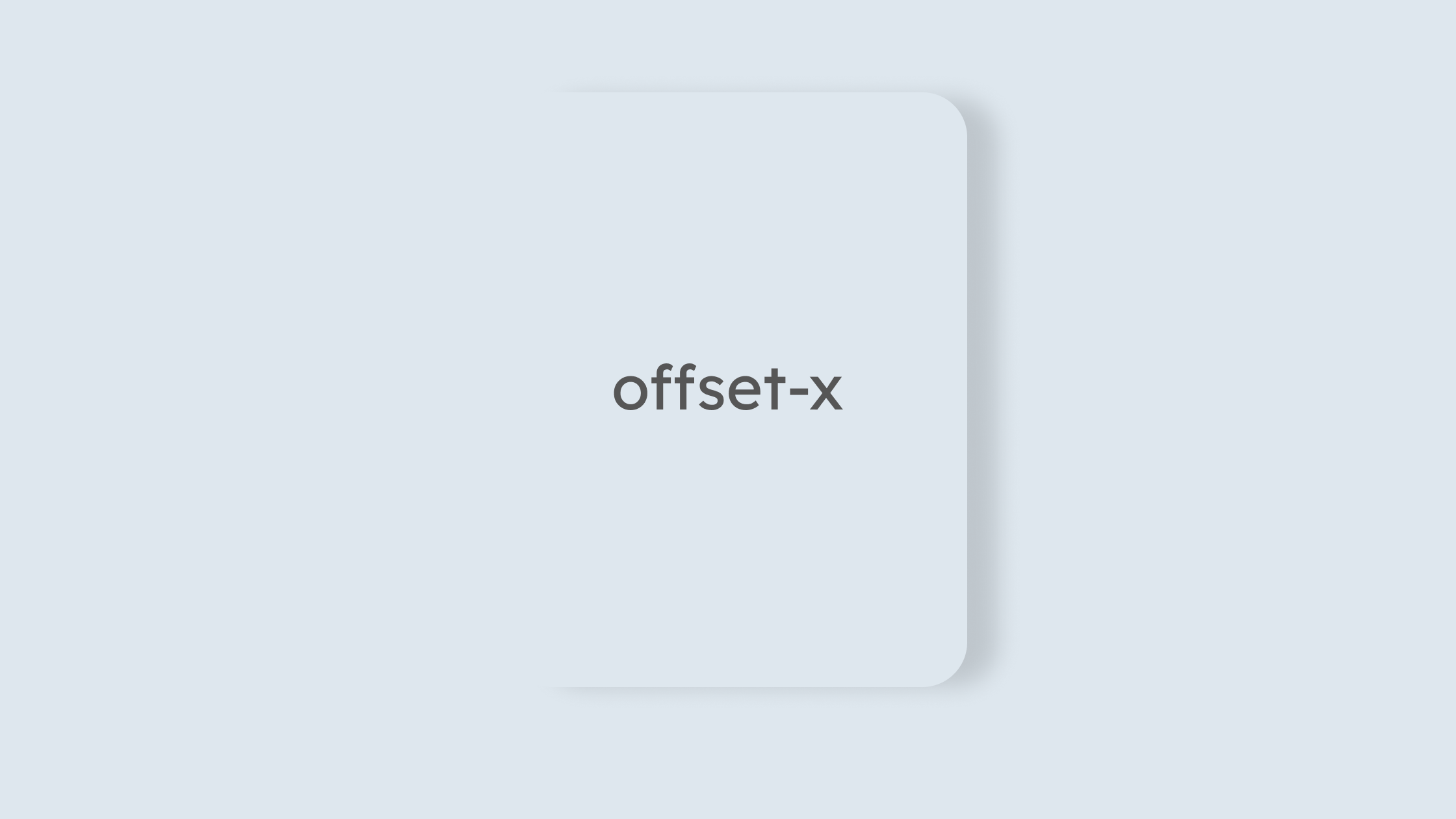
Offset-x

offset-x is just a box-shadow value where shadows go on the horizontal way. It means whenever you input the offset-x value it determines to follow in the left or right direction. For eg,

|this is offset-x value|<br> box-shadow: <mark>20px</mark> 0px 52px -5px #a3a3a3 ;

Picture reveals the detail on box-shadow offset-x


box-shadow,css box-shadow,box-shadow css,css3 box-shadow,css box-shadows,css box-shadows tutorial,multi box-shadow,css box-shadows explained,box-shadow tutorial,css inset box-shadow,box-shadow generator,css box-shadow tutorial,css box-shadow tutorial basics,css box-shadow tutorial: the basics,box-shadow css3,тень box-shadow,box-shadow hacks,gerador box-shadow,como usar box-shadow,box-shadow animation,propiedad box-shadow,box-shadow transition,layered box-shadows,tutorial css box-shadow


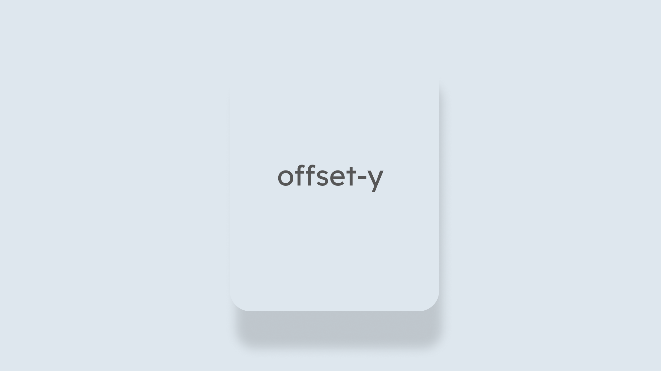
Offset-y

Same as the above one offset-x moves onto a horizontal side thus offset-y moves in the vertical direction which is top to bottom

|this is offset-y value|<br> box-shadow: 0px <mark>33px</mark> 27px -5px #808080 ;

Picture reveals the detail on box-shadow offset-y


box-shadow,css box-shadow,box-shadow css,css3 box-shadow,css box-shadows,css box-shadows tutorial,multi box-shadow,css box-shadows explained,box-shadow tutorial,css inset box-shadow,box-shadow generator,css box-shadow tutorial,css box-shadow tutorial basics,css box-shadow tutorial: the basics,box-shadow css3,тень box-shadow,box-shadow hacks,gerador box-shadow,como usar box-shadow,box-shadow animation,propiedad box-shadow,box-shadow transition,layered box-shadows,tutorial css box-shadow


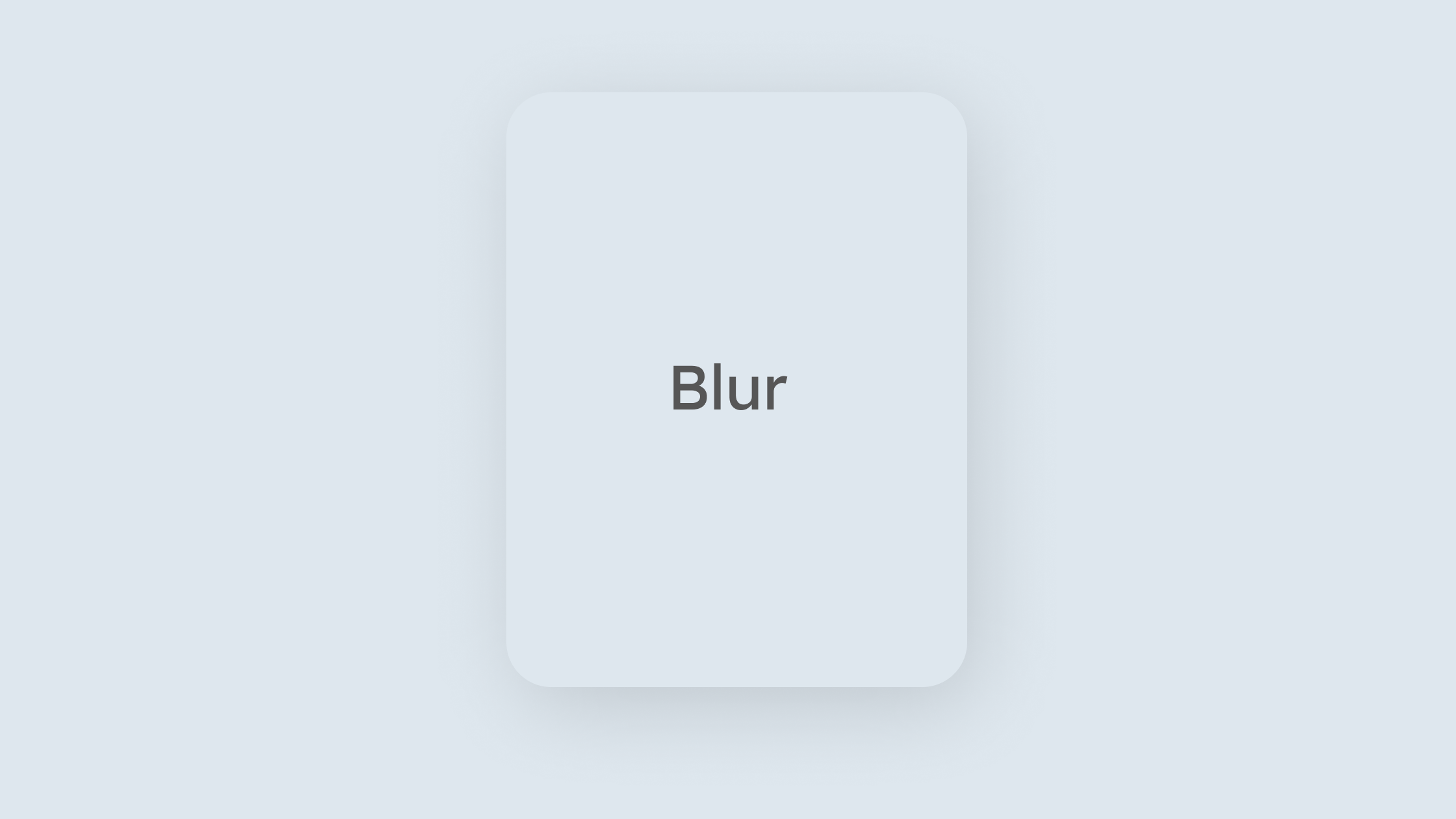
Adding a Blur Value

If you want the shadow to look a little more realistic, You have to adjust the blur values.

|this is blur value|<br> box-shadow: 0px 0px <mark>40px </mark> -5px #757575 ;

Picture reveals the detail on box-shadow blur value


box-shadow,css box-shadow,box-shadow css,css3 box-shadow,css box-shadows,css box-shadows tutorial,multi box-shadow,css box-shadows explained,box-shadow tutorial,css inset box-shadow,box-shadow generator,css box-shadow tutorial,css box-shadow tutorial basics,css box-shadow tutorial: the basics,box-shadow css3,тень box-shadow,box-shadow hacks,gerador box-shadow,como usar box-shadow,box-shadow animation,propiedad box-shadow,box-shadow transition,layered box-shadows,tutorial css box-shadow


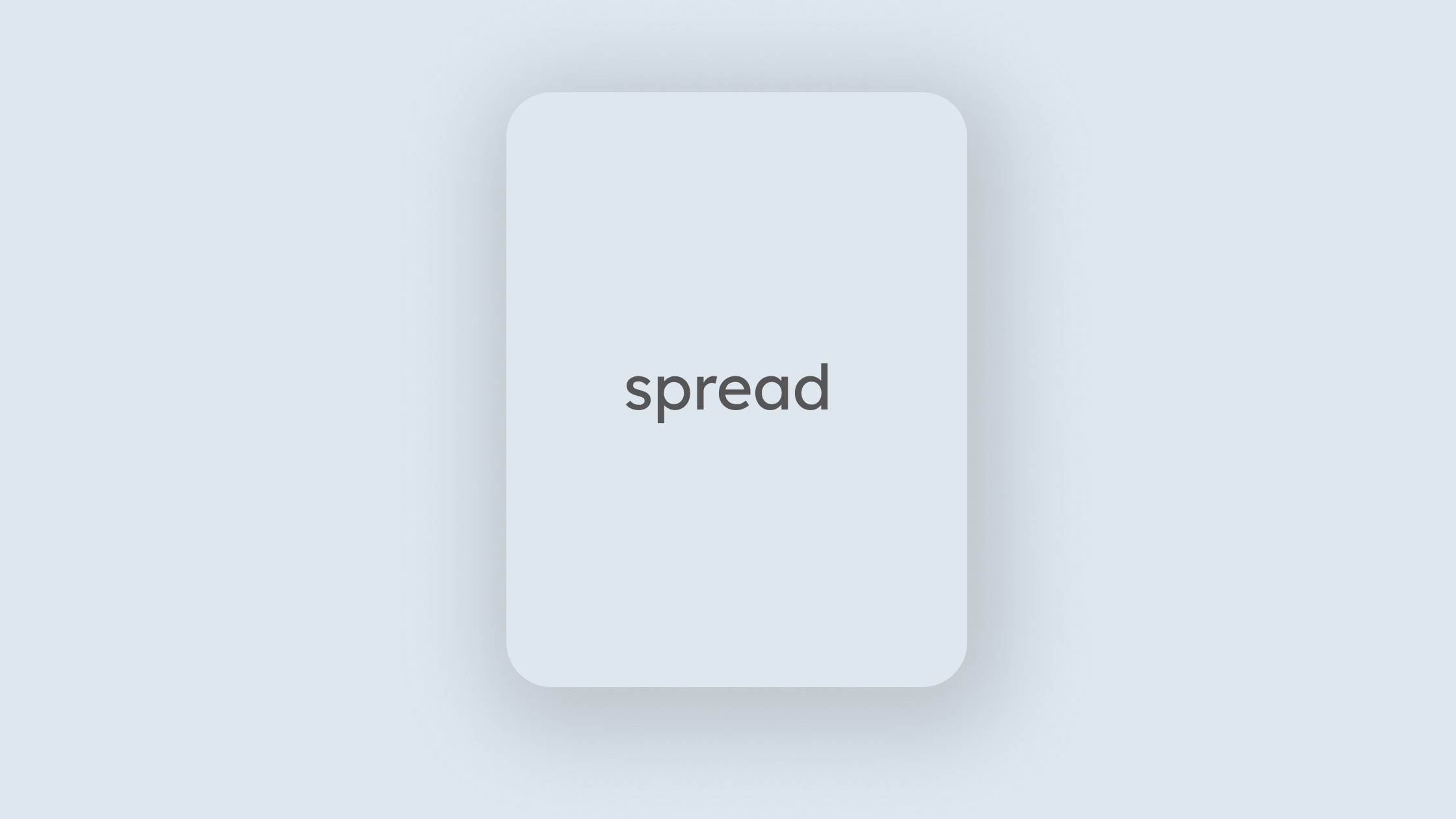
Adding a Spread Value

Spread value in the CSS box-shadow works as size or scale up or down. you can make a box shadow either small or large it depends on your required design.

|this is spread value|<br> box-shadow: 0px 0px 27px <mark>33px</mark> #bdbdbd ;

Picture reveals the detail on box-shadow spread value


box-shadow,css box-shadow,box-shadow css,css3 box-shadow,css box-shadows,css box-shadows tutorial,multi box-shadow,css box-shadows explained,box-shadow tutorial,css inset box-shadow,box-shadow generator,css box-shadow tutorial,css box-shadow tutorial basics,css box-shadow tutorial: the basics,box-shadow css3,тень box-shadow,box-shadow hacks,gerador box-shadow,como usar box-shadow,box-shadow animation,propiedad box-shadow,box-shadow transition,layered box-shadows,tutorial css box-shadow


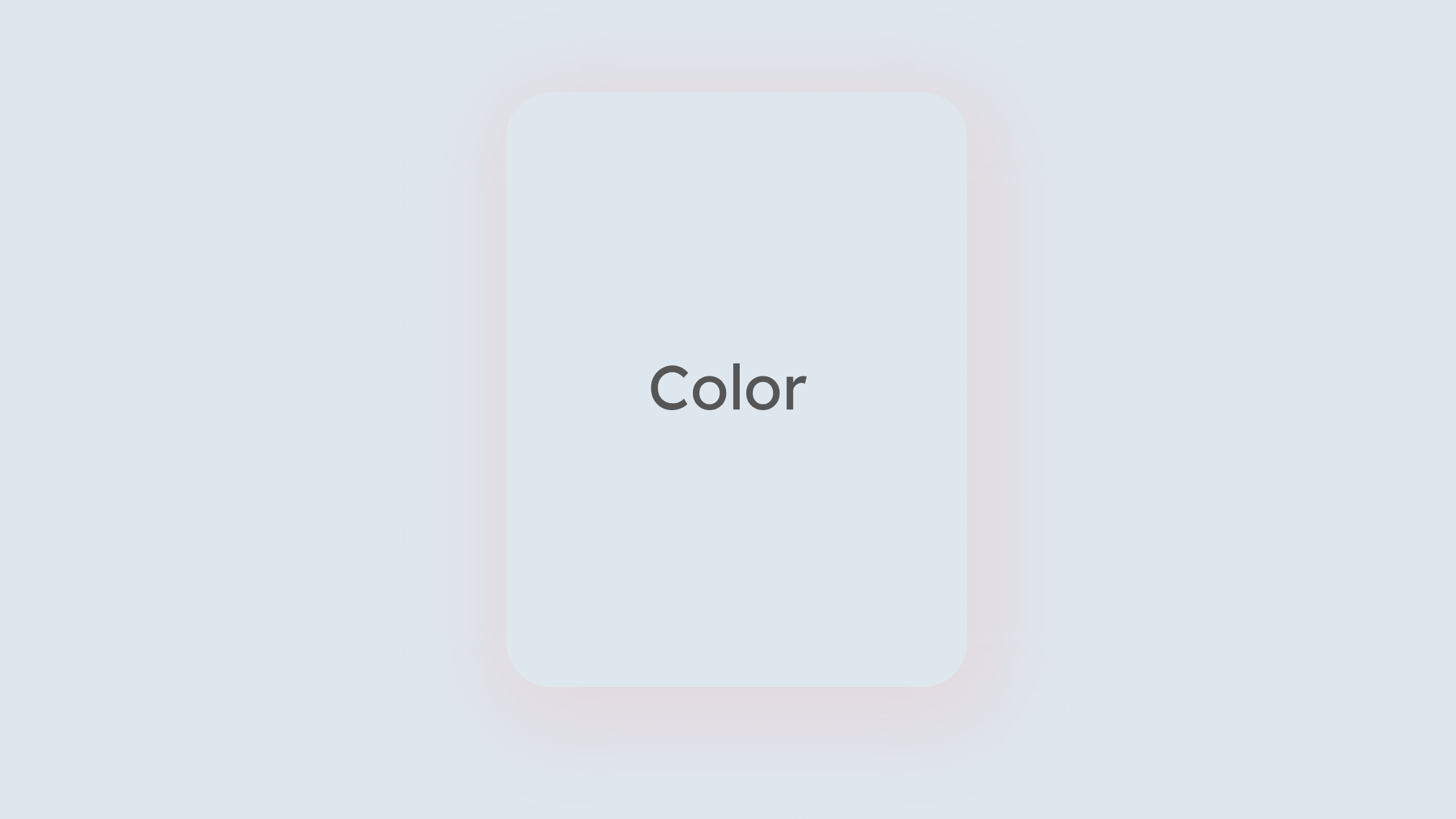
Adding a Color

You can add color to box-shadow either on Hex Value or RGB value.

|this is color value|<br> box-shadow: 0px 0px 27px -5px <mark> #ff9999 </mark>;

Picture reveals the detail on box-shadow color value


box-shadow,css box-shadow,box-shadow css,css3 box-shadow,css box-shadows,css box-shadows tutorial,multi box-shadow,css box-shadows explained,box-shadow tutorial,css inset box-shadow,box-shadow generator,css box-shadow tutorial,css box-shadow tutorial basics,css box-shadow tutorial: the basics,box-shadow css3,тень box-shadow,box-shadow hacks,gerador box-shadow,como usar box-shadow,box-shadow animation,propiedad box-shadow,box-shadow transition,layered box-shadows,tutorial css box-shadow


What does a box-shadow generator online do?

Box-shadow generator is an online tool where you can customize your CSS box-shadow manually. This tool helps you to maintain CSS box-shadow code faster and easier. It not only contains manual functions but also you get more than 85 readymade box-shadow for free. You just needed to copy by pressing the mouse button.